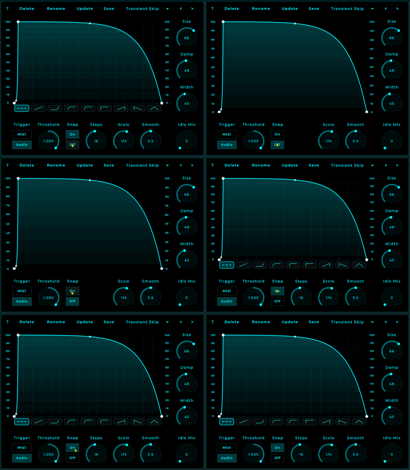
I think it’s fine, minimalistic and compact. Having it tight to have all controls in a short reach is a good design. Now i am not personally a one colour design lover but you can even easily do a colour theme based design. But that does not having to do with your design as is. it looks completly fine. all aligned, enough space between the controls.
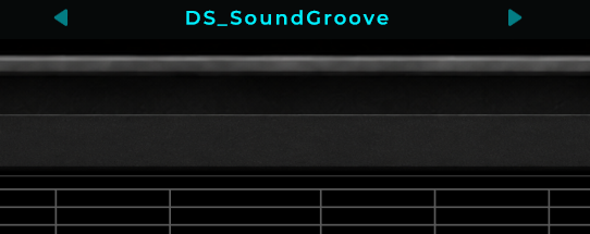
i do agree however it drives me nuts having a non matching blue bar on top from mnodes itself
yeah i do like minimalistic i will use this as an template to do the same with many mnodes fx initialy and later combine some things into one for pro versions aimed at pads or bass specific
I understand that. i personally would love that this colour could be changed:
I have no problems with that it’s a MNode project in performance mode, and you can just go into the visual code.. anyone can. it should be there.
And for this, would love to disable that. it has no purpose in performance mode. because any previous or next will never be the project i would have to use in a real case. that means if i want this make useful i have to remove all kind of projects otherwise i would have to skip numerous projects.
And with this i don’t have any problems with, can be there. i mean. kontakt and such software have this also. but the colour design or even, i would like to disable it because in the end i am responsible to make sure, with the nodes to limit the output.
But that’s just my personal view on it.
But i would also be completely fine if the whole bar can be made invisible and reachable with a ctrl-alt-key option.
Hey, yes! I’m thinking about what I can do to make the menu bar integrate better in Perform mode, while still leaving something visible so users who only use Perform mode know where to go from the moment they first open MNodes. It’s not a top priority, but it’s definitely on the table.
maybe a widget that has a button to toggle, it could have a fixed mnodes emblem with adjustable colour and that way there is also still the option to keep it as is for those who want to
come to think of it a button that can send native hotkeys would do that and also add more options you could use on the gui like + _ to change the size if that where a hotkey
also i think i am better of making it a dry and wet control vs a idle mix because wet there would just change the range of the envelope. then i can make it wider giving more room for preset names. also add in some meters then